
Welcome to KinBloom
I wanted to create a project for a cause that I am passionate about. My food allergies have made me on the lookout for food alternatives. I decided to turn my passion into a branding project.
Goal:
Case study: create a welcome campaign to increase first time subscribers through the website, social media, print materials, and email design.
Tools:
Adobe Photoshop and Adobe Illustrator.
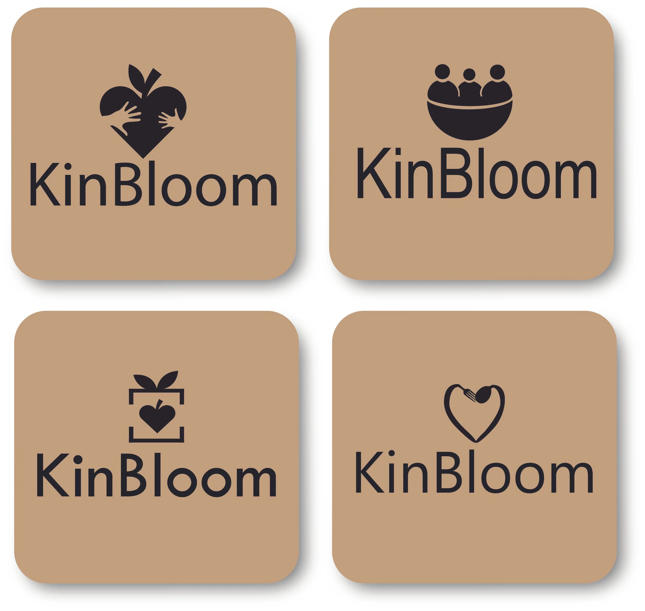
Allergy-friendly Logo
The vision for the logo was to capture the warm, friendly and trustworthy tone with a hint of playfulness. The icons chosen for the logo drafts each carry symbolism.
The person shape icon shows family. The hands represent families sharing and passing food to each other. The heart shows kinship. The apple represents health.
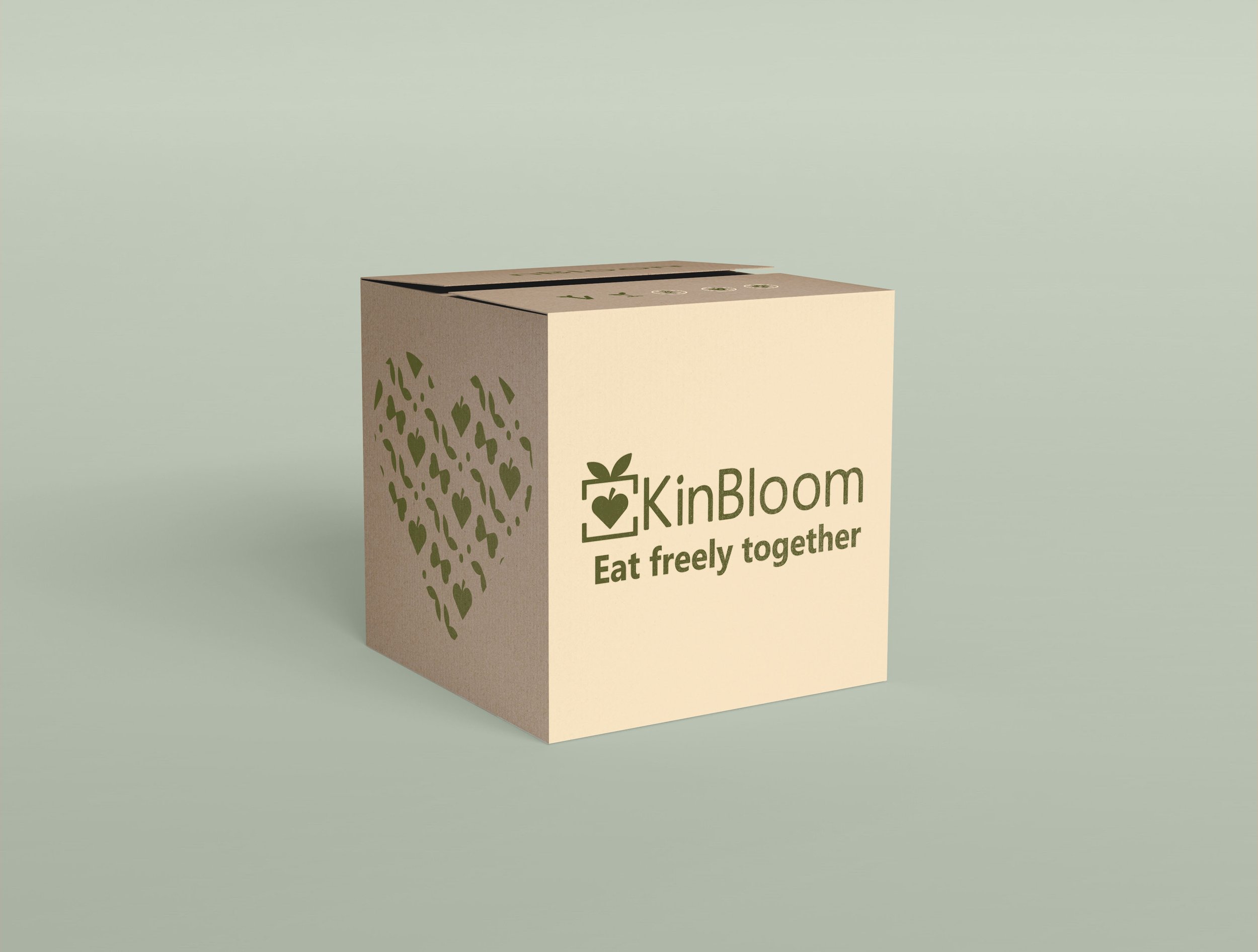
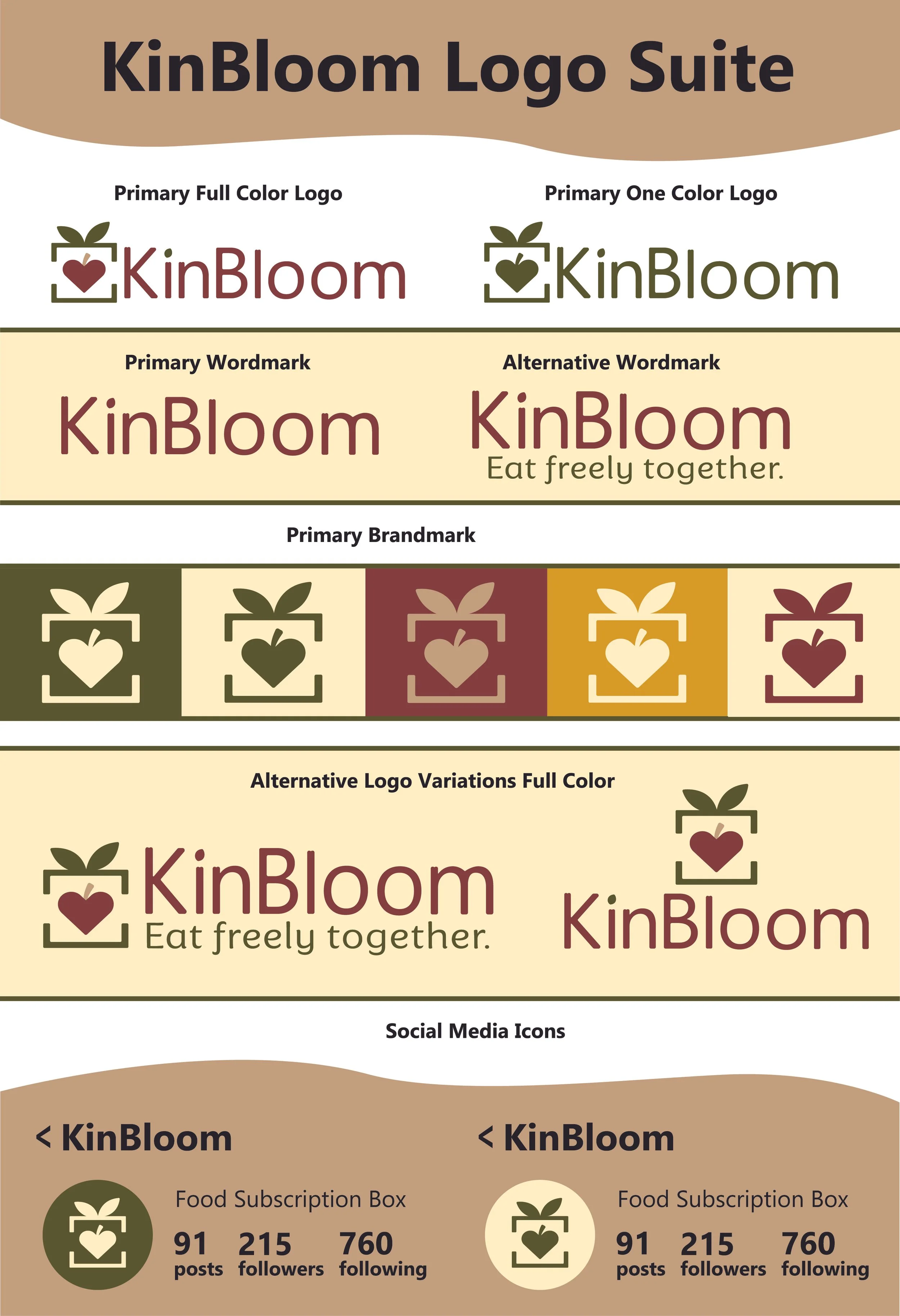
The Warm Logo Suite
The final logo uses a color palette focused on warmth and coziness. The font chosen communicates friendliness and trust.
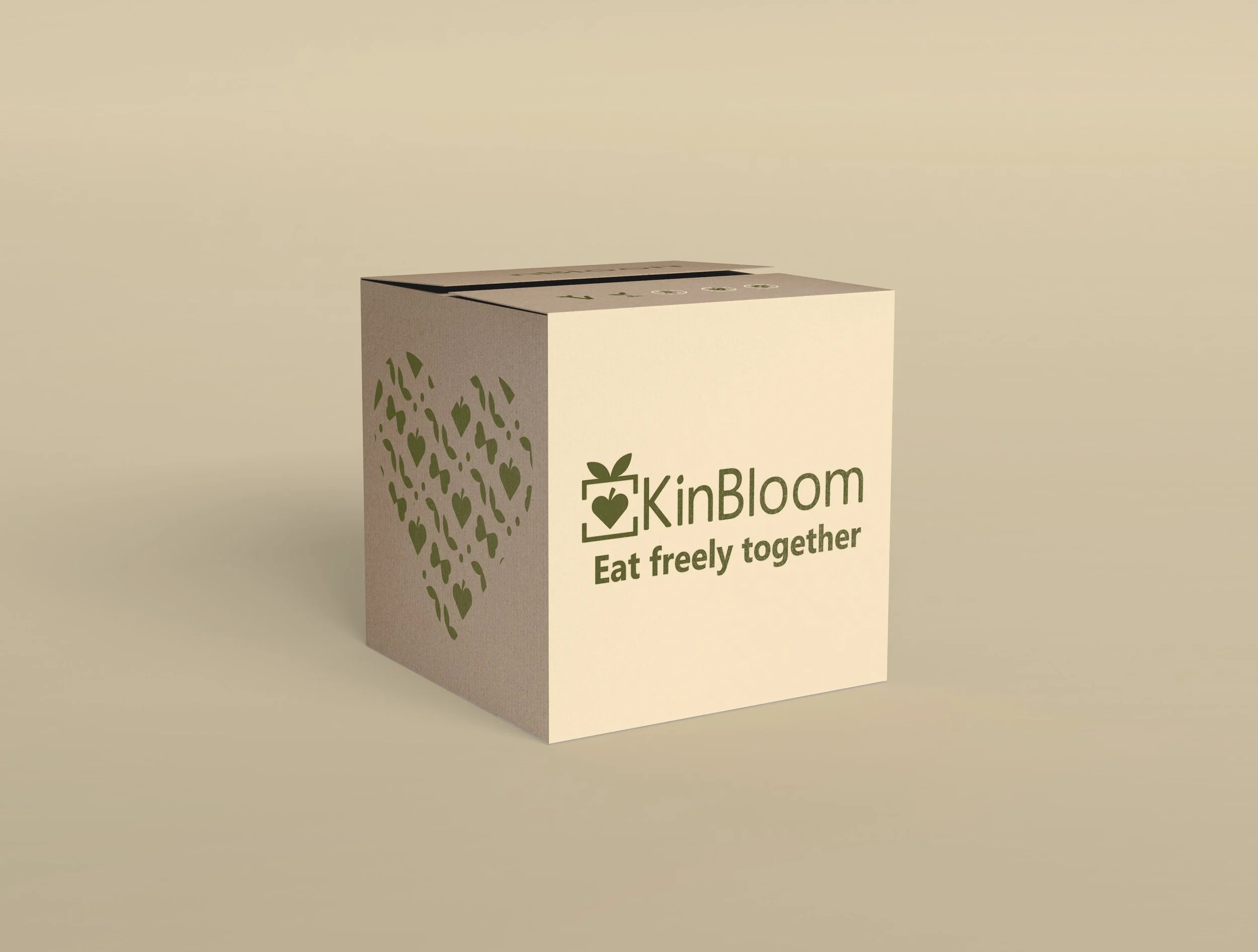
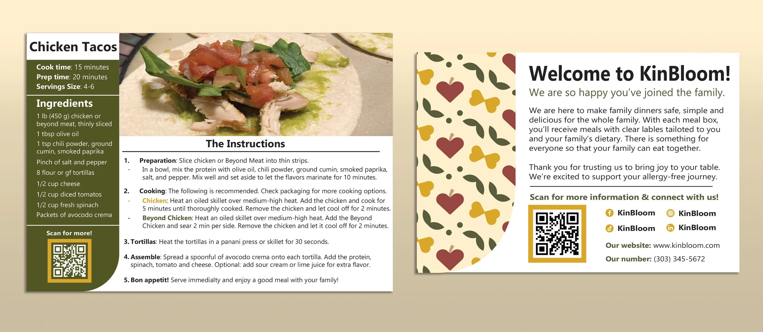
The delivery box communicates allergies through the symbols on the flaps. The recipe and welcome card both present friendliness and warmth.
Packaged in Warmth
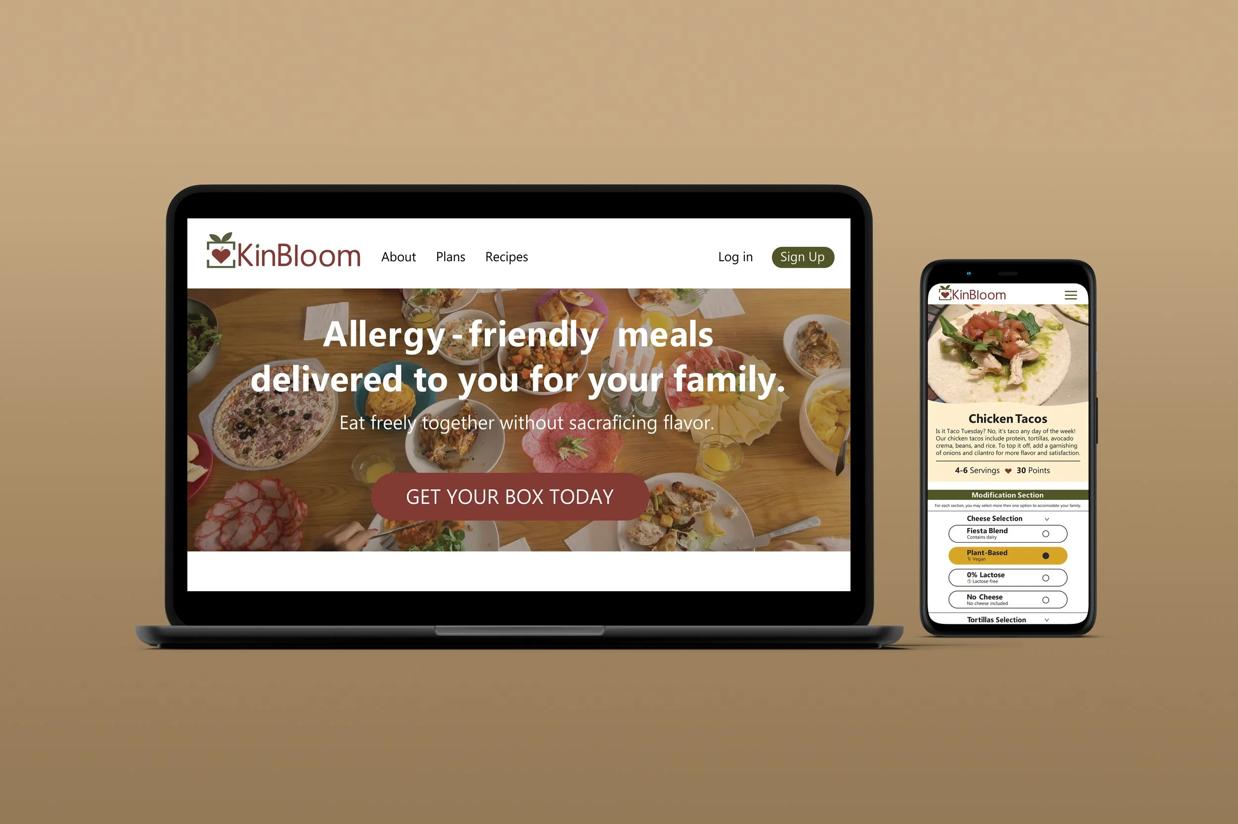
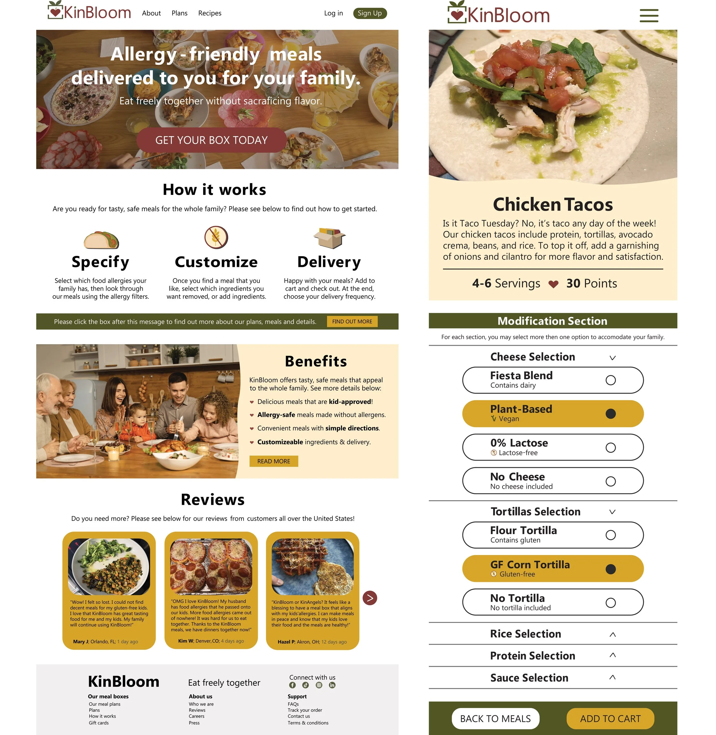
The mockup features the two most important pages: the home page and meal customization page. The tone is warm, cozy and trustworthy.
Customizing the food box
Information in Hand
Through emails, KinBloom aims to educate, promote, and inform new subscribers about the subscription process and dietary safety and transparency.
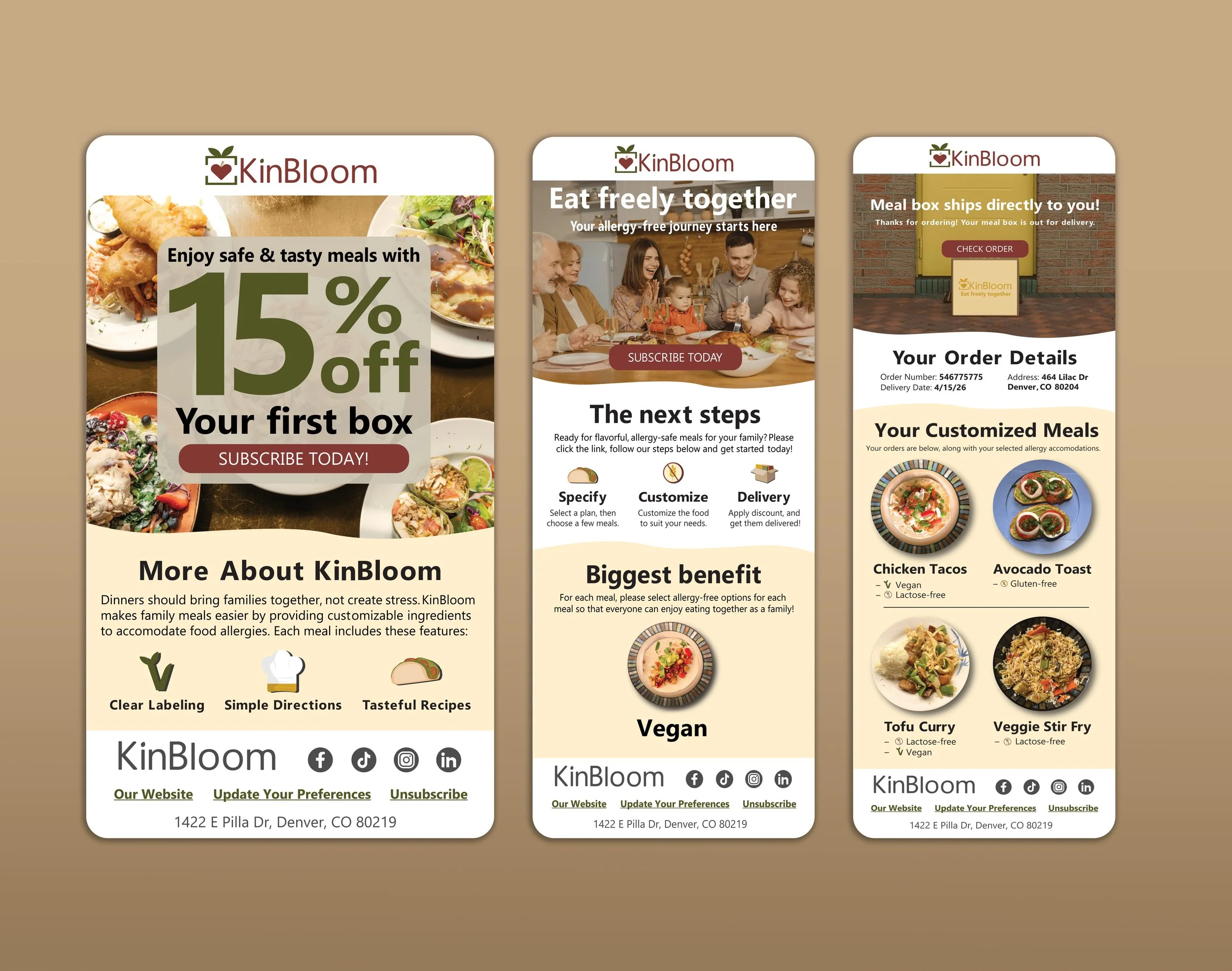
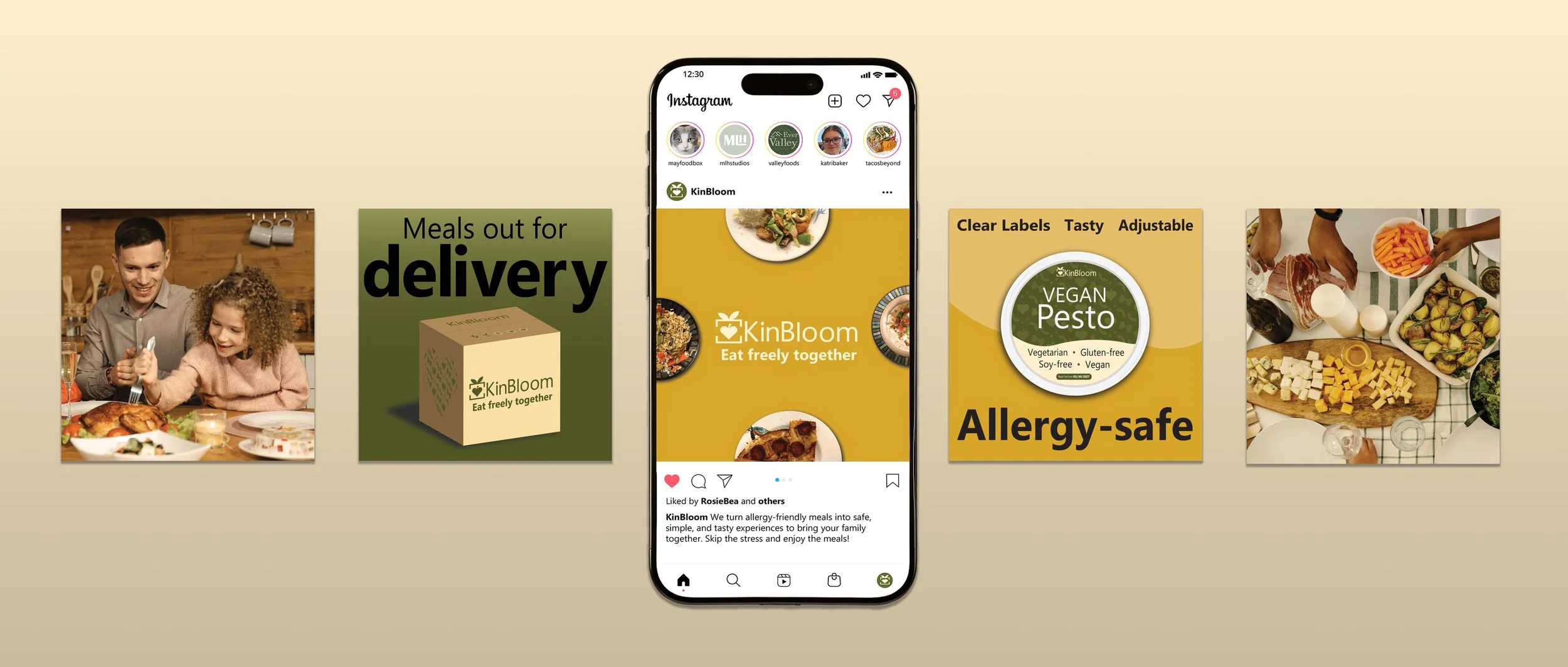
A Digital Welcome
To welcome new subscribers, their social media communicates the warm, family-friendly brand connection and offers highlights of what Kin Bloom provides.
Conclusion:
I felt inspired by the work that aligns with my values and interests. I love how warm and vibrant the colors are. I had so much fun creating this project!
Knowledge Gained:
My experience with food allergies has given me insight into the importance of accommodation. I am excited to create inclusive projects in the future.